Clustering
Overview
So what is clustering? Machine learning clustering is like having a magical helper who can look through a big bag of M&M’s and group them together based on their colors. So, all the red go in one group, all the blue in another, and so on. It’s like having a friend who’s really good at sorting and helps you play with your food by putting similar ones together. However, clustering isn’t just about having fun with candy, but it can be extremely helpful as a unsupervised learning method that can identify data points that group together even in higher dimensionality. Clustering is an unsupervised machine learning technique and is designed to operate in situations where data lacks predefined labels or categories. Its core purpose is to discern latent patterns and structures within a dataset, essentially conducting an exploratory analysis to ascertain if the data naturally groups into discernible clusters or categories. This process of pattern identification carries significant practical implications, as the identified clusters can subsequently serve as valuable inputs for a range of analytical tasks, including classification and prediction. Moreover, clustering plays a pivotal role in dimensionality reduction, simplifying intricate datasets by organizing data points into coherent groupings. This process effectively transforms complex data into more manageable and interpretable units, providing a structured foundation for enhanced data insights and decision-making.
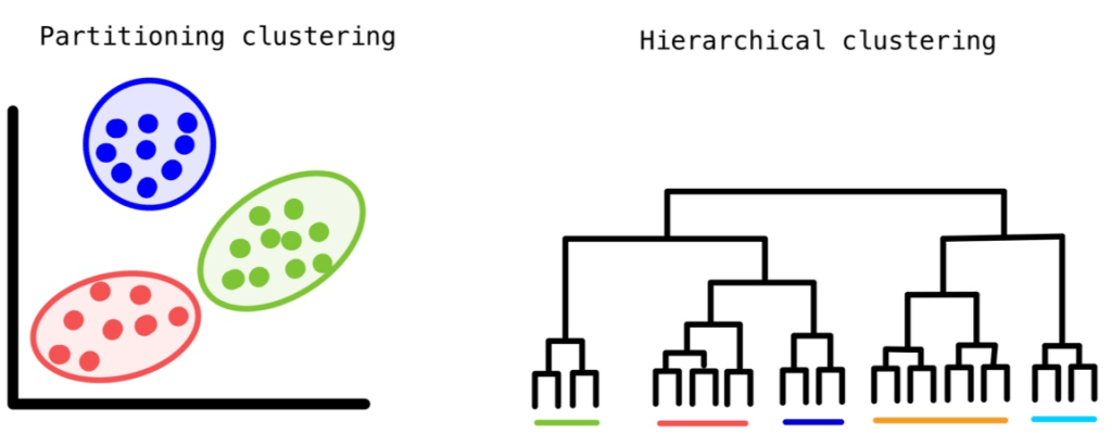
There are several approaches to clustering data. Partitional Clustering, as exemplified by k-means, focuses on dividing data into nonoverlapping groups. In this method, each data point belongs to only one cluster, and every cluster must have at least one member. On the other hand, Hierarchical Clustering takes a different route by constructing a hierarchy of clusters. This can be achieved either from the bottom up (agglomerative) or from the top down (divisive), resulting in a dendrogram—a tree-like structure that provides insights into the relationships between clusters. Lastly, Density-Based Clustering is an approach that assigns data points to clusters based on their density within a specific region. Here, you don’t need to predefine the number of clusters; instead, you fine-tune a distance-based parameter, making it highly adaptable. Notable among these techniques is DBSCAN (Density-Based Spatial Clustering of Applications with Noise), recognized for its ability to uncover clusters of varying shapes and sizes.
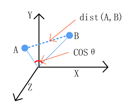
At the core of clustering lies the fundamental objective of organizing data vectors into groups based on their similarity while simultaneously distinguishing dissimilar vectors. To determine this similarity, it’s crucial to employ a measure of similarity, in this case, as a measured distance. Two broad categories of distance measures are typically used for this purpose. First, there’s the Euclidean distance, well-suited for gauging the similarity of real-valued attributes and dense data points. Euclidean distance uses the spatial location of each vector, treating them as coordinates in a multi-dimensional space. Two examples of Euclidean distance metrics are the L1 norm and the L2 norm. L1 norm is the sum of the differences in each dimension and the L2 norm is square root of the sum of the squared distances. Non-Euclidean measures rely on vector properties rather than spatial coordinates, offering a versatile alternative for assessing similarity across diverse datasets. An example of a non-Euclidean distance measure is the Cosine Similarity which uses the cosine of the angle between vectors to determine the similarity of two points. These measures collectively form the foundation upon which clustering algorithms operate, facilitating the creation of meaningful groups within the data.
Now that we’ve delved into the fundamentals of clustering techniques and how they help us make sense of complex datasets, let’s turn our attention to their practical applications, particularly in the context of wildfires in the United States. By applying these clustering techniques to wildfire data, we can uncover valuable insights into the patterns and trends of these destructive events, helping us enhance preparedness and response efforts. Additionally, when we combine this analysis with data from the US Drought Monitoring data, we gain a comprehensive view of the environmental conditions that contribute to wildfires. This approach provides the knowledge needed to better prepare, respond, and mitigate the impacts of wildfires on communities and ecosystems. Let’s explore how clustering methods can provide insights and play a pivotal role in this vital area of environmental analysis.
Data Prep
Most of the data preparation occurred during the data cleaning steps found on the DataPrep/EDA page, and so for a detailed demonstration of the cleaning preparation check out that page. For access to the code for the cleaning and to see the raw and cleaned datasets check out the code repository here. A general overview of the cleaning included: removing columns that don’t provide interesting information for the analyses, removing columns and rows with null values or incorrect information, fixing data types, and in specific cases merging datasets. For unsupervised learning such as clustering, a couple more steps had to be performed so that the necessary techniques could be applied. Note an example of the preparation down to the cleaned Drought Monitoring data for the US states total areas.
Some of these extra steps involved only selected columns that were unlabeled and quantitative. Another decision in the preparation process was choosing columns of that seemed like they could lead to interesting results. Clustering can be strongly inhibited by high-dimensionality, therefore it is good to think of it as less is more.
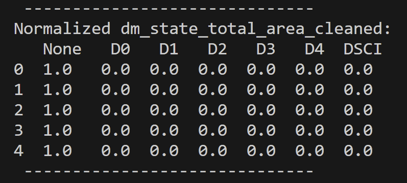
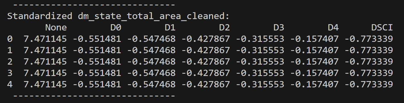
As a final additional step in the data preparation was data normalization or standardization. Both methods were used and tested against not doing either. Some results were more informative than others.
For the text vectorized data labels were removed, but the values were not transformed in any way.
Clustering techniques are ideally suited for unlabeled quantitative data due to their mathematical nature and by the way they uncover hidden structures in datasets. The primary reason is that clustering aims to discover patterns or groupings within data without the need for predefined labels or categories. It accomplishes this by relying on distance or similarity metrics, which quantitatively measure the proximity of data points to one another. These metrics are well-defined for numerical data, making quantitative attributes the natural choice. Clustering thrives on the calculation of distances between data points, which are straightforward when dealing with numerical values.
Code
All code associated with the clustering performed and for all other project code can be found in the GitHub repository located here. Also the specific clustering code is in the files named: clustering_kmeans_main.py and hclust.Rmd. Another note to make is a some inspiration for the code is from Dr. Ami Gates, both in clustering in Python1 and in R2. Another useful resource for understanding the content was the article A Friendly Introduction to Text Clustering by Korbinian Koch, and a quick shout out to the documentation for kmeans3 and hclust4.
Results
In this section, we’ll be presenting the findings of our clustering analysis, offering a blend of K-means and hierarchical clustering insights. We aim to provide you with a comprehensive understanding of our discoveries, complemented by informative visuals like dendrograms and clustering images. Additionally, we conducted an exploration of various K values in the context of K-means clustering to enhance our analysis.
K-Means Clustering Analysis
Selection of K Values
To unravel the inherent structure within our dataset, we engaged in K-means clustering experimentation, considering different K values upon multiple datasets around the topic of wildfires and drought in the United States. This partitioning approach allowed us to assess how our data naturally coalesces under different scenarios.
Beyond just exploration, we took a more quantitative approach to determine the optimal K value for K-means clustering. We harnessed the Silhouette method, which objectively gauges the suitability of different K values by evaluating how well data points align within their assigned clusters relative to other clusters. Silhouette analysis studies the distance between neighboring clusters, while also giving information about the distance between points inside the same cluster.5 By calculating Silhouette scores across various K values, we aspired to pinpoint the K value that best aligns with our dataset’s underlying structure.
For each of the datasets analyzed silhouette scores were generated for each of them. One can view all of these graphs in the GitHub repository here. The images on the below are a quick representation of how some of these analyses helped with the decision on what value of k to use for k-means clustering.
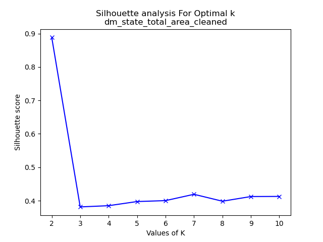
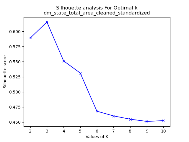


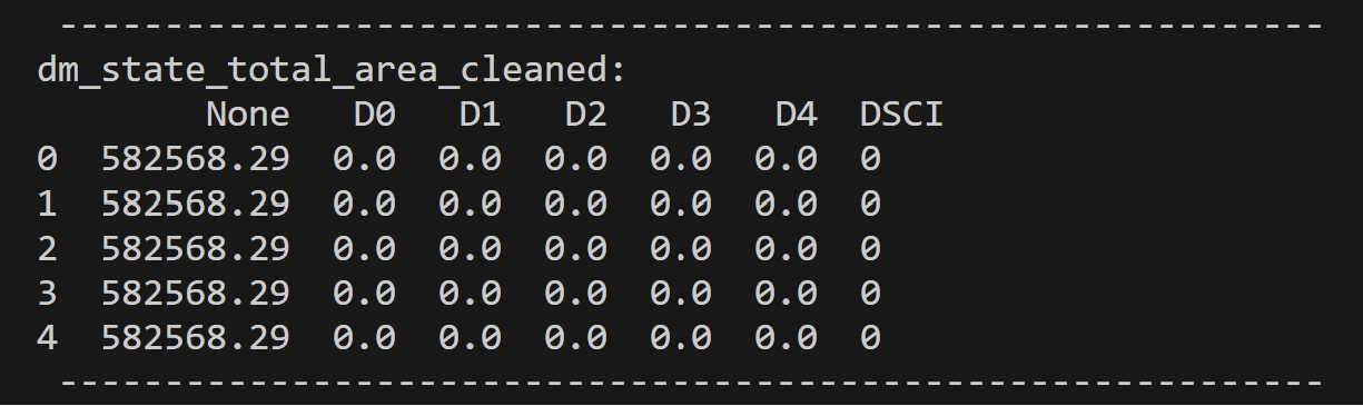
Let’s analyze the datasets we’ve chosen and their respective optimal clustering values. First, in the context of the Drought Monitoring data for US states’ total areas, the silhouette method suggests that k=2 is the most suitable choice. However, it’s important to note that when considering the standardized values of the total area in the drought monitoring dataset, k=3 emerges as the optimal number of clusters. This underscores the significance of standardization in clustering analysis. Standardization enables distances between data points to align more closely with their inherent groupings, mitigating the influence of varying magnitudes across dimensions. Note that the drought dataset for total area was comprised of seven variables. “None”, “D0”, “D1”, “D2”, “D3”, and “D4” are variables denoting the number of acres affected by that level of drought at a given time in a given state. “None” defines no drought and “D4” is extreme. Lastly “DSCI” is the measurement of the Drought Severity and Coverage Index.
Moving on to the text dataset that examines fire cause comments in Oregon from 2000 to 2022, the plot of results is somewhat unusual, indicating an ideal k value of 10. This deviation from the typical optimal k values ranging from 1 to 4 prompts us to question whether k-means clustering, particularly in conjunction with PCA, is the most appropriate method for this dataset. Note that this dataset is comprised of a dictionary of words found in fire cause comments for Oregon fires from 2000 to 2022. This data was made quantitative by counting the number of times a particular word was used in a particular case.
Lastly, we delve into the dataset focusing on the monthly statistics of wildfire burn areas between 2000 and 2022. In this case, the silhouette method, following standardization, suggests an optimal k value of 2. This choice is particularly relevant because it rectifies the scale discrepancy between “Number of Fires” and “Acres Burned,” as well as “Acres Burned per Fire.” Given the potential for fires to encompass hundreds or even thousands of acres, standardization ensures a fair analysis of these variables.
The other graphs demonstrating the silhouette method are seen in the folder as described above. However, now let us look into the results of the K-Means clustering given the values of k as determined by the silhouette graphs and looking into the graphs if we choose other values of k instead.
K-Means Clustering and Resulting PCA Graphs
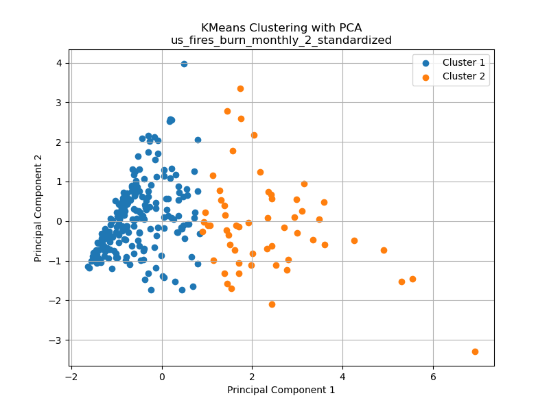
Note that the following graphs are from datasets that have high dimensionalities (dimensions ranging from 2 – 76). For the purposes of creating visually possible representations, Principle Component Analysis – PCA was performed to transform high-dimensional data into a lower-dimensional representation while retaining as much of the original data’s variance as possible.
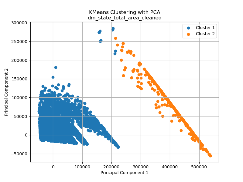

The displayed graphs above correspond to the previously mentioned subset chosen for assessing the ideal number of clusters through the silhouette method. From a visual perspective with the help of Principal Component Analysis (PCA), the data on the total area affected by drought from 2000 to 2022 readily lends itself to the identification of two distinct clusters. K-Means reinforces this observation by revealing two clearly distinguishable clusters. While one could hypothesize the existence of a third cluster, the silhouette method firmly supports the notion of two clusters.
The subsequent graph illustrates a scenario where k-means clustering may not be the most suitable choice. Despite the earlier indication that 10 clusters were deemed optimal for this dataset, the application of PCA casts doubt on this assertion. If an alternative approach like density-based clustering, such as DBSCAN, were employed, the argument for a single cluster becomes more plausible. In the hierarchical clustering analysis performed later, we observe much more promising outcomes, particularly in the case of text datasets. That all said, it is also important to note that visuals can be deceiving as this dataset is comprised of 75 dimensions. Therefore 10 clusters is not that unreasonable with that in mind.
Finally, on the right side, we present the dataset concerning US wildfires per month. In this instance, we discern a reasonably credible dataset comprising two clusters. This conclusion is based on the standardized values of the three dimensions: “Number of Fires,” “Acres Burned,” and “Acres Burned per Fire.” This pattern in the data opens up intriguing possibilities for gaining deeper insights into the relationships among these three variables.
These three graphs are not the only three k-means clusters found for this project. The other’s may be found on the GitHub repository here.
Now to look at the dataset from the total areas affected at different levels of drought in the United States from 2000 to 2022 for the different k values (2, 3, and 4 respectively).
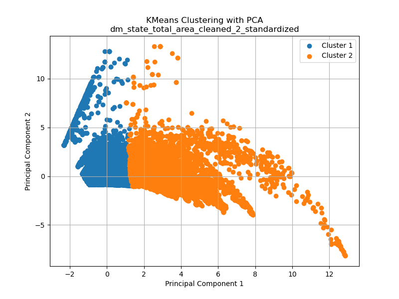

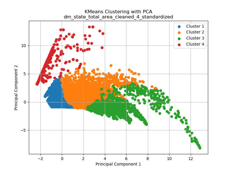
The displayed graphs provide valuable insights into the impact of different values of k on the results of k-means clustering. It’s crucial to recognize that k-means relies on distance metrics to determine distinct clusters. While the silhouette plot suggests that an optimized number of clusters is 3, the manner in which k-means selects and forms these clusters may not align with this intuitive assessment. This discrepancy is partly attributable to the transformation carried out using Principal Component Analysis (PCA), a technique employed to reduce the dimensionality of the dataset, which for this data is originally in seven dimensions. PCA can potentially alter the distribution and arrangement of data points, affecting the cluster formation.
Another noteworthy observation drawn from the three graphs is that clustering appears to be most effective when the optimal cluster value of three is utilized. When k=2, it captures the primary patterns but may miss some finer details within the data. Conversely, when k=4, the clustering process becomes overly complex, potentially introducing subclusters or spurious groupings that do not correspond well to the underlying data structure. Therefore, the selection of an appropriate value of k is a critical decision in k-means clustering, as it directly impacts the quality and interpretability of the resulting clusters.
Hierarchical Clustering Analysis
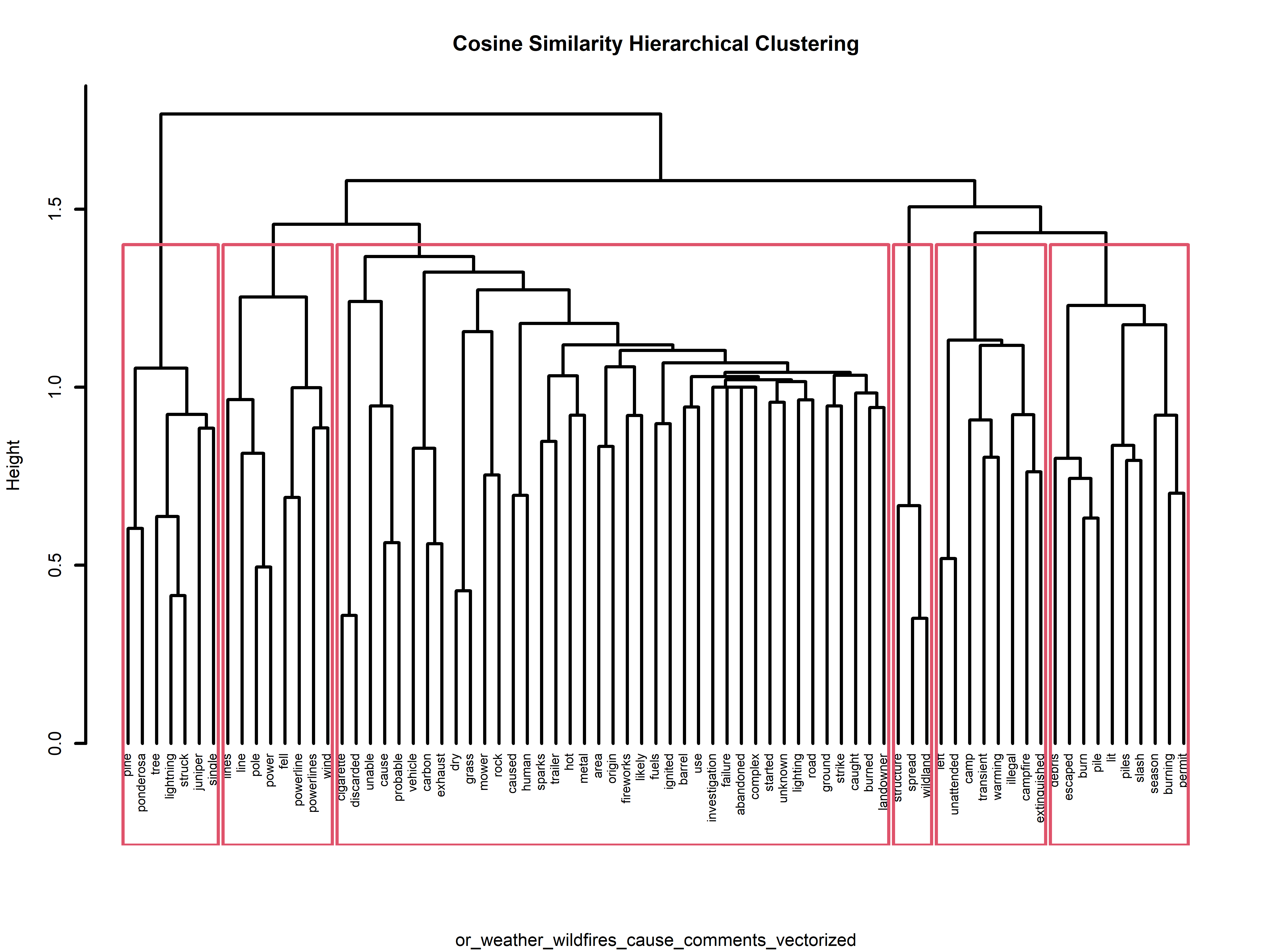
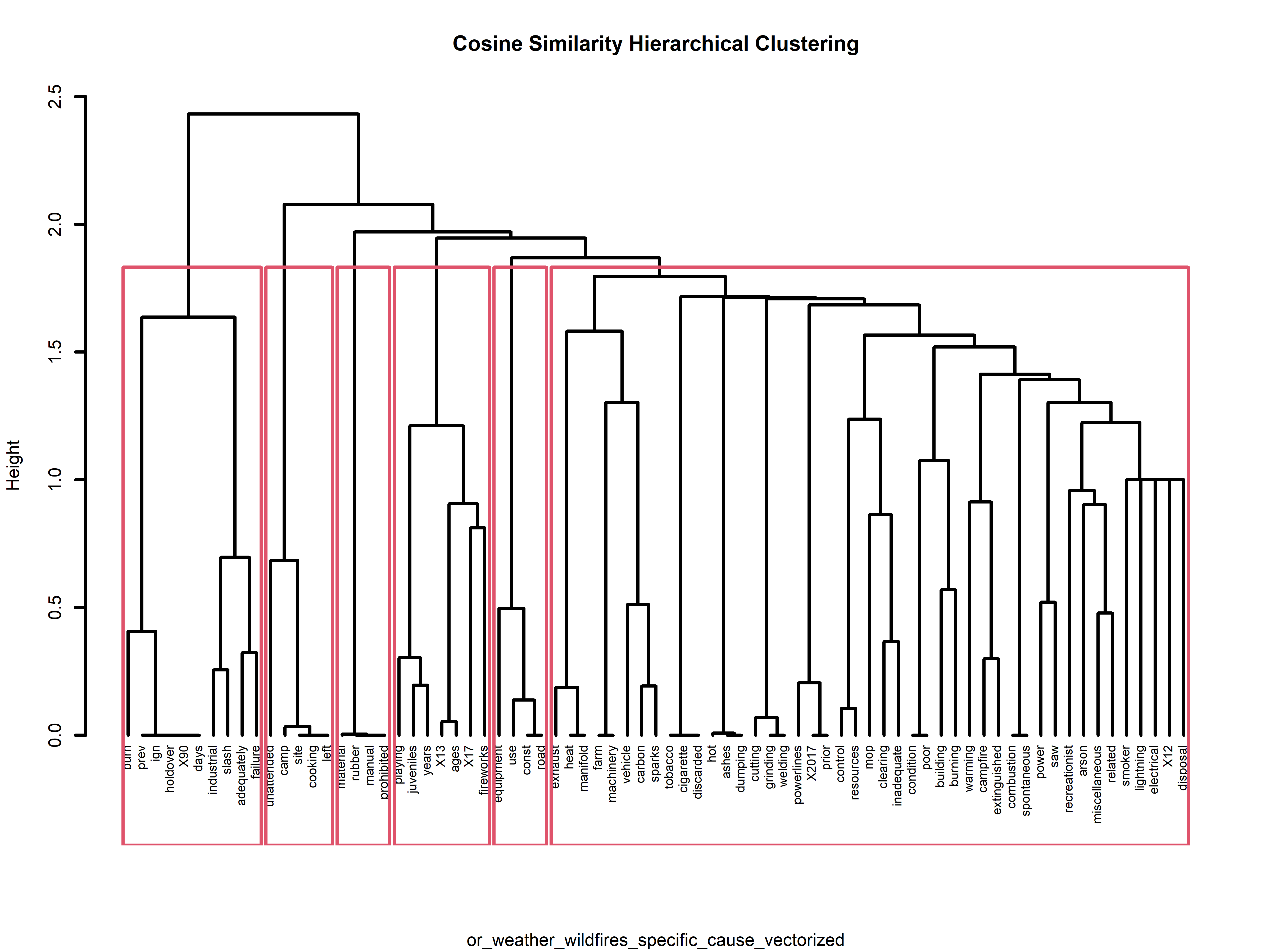
In addition to our K-means exploration, we delved into hierarchical clustering, which constructs a dendrogram – akin to a family tree – illustrating hierarchical relationships among data points. For this particular analysis the datasets that gave the most interesting results were those of text data (note that hierarchical clustering was performed also on other numerical data). Below are four examples of the results of the hierarchical clustering using cosine similarity. If one is interested in seeing more they can find the visuals on the GitHub repository here.

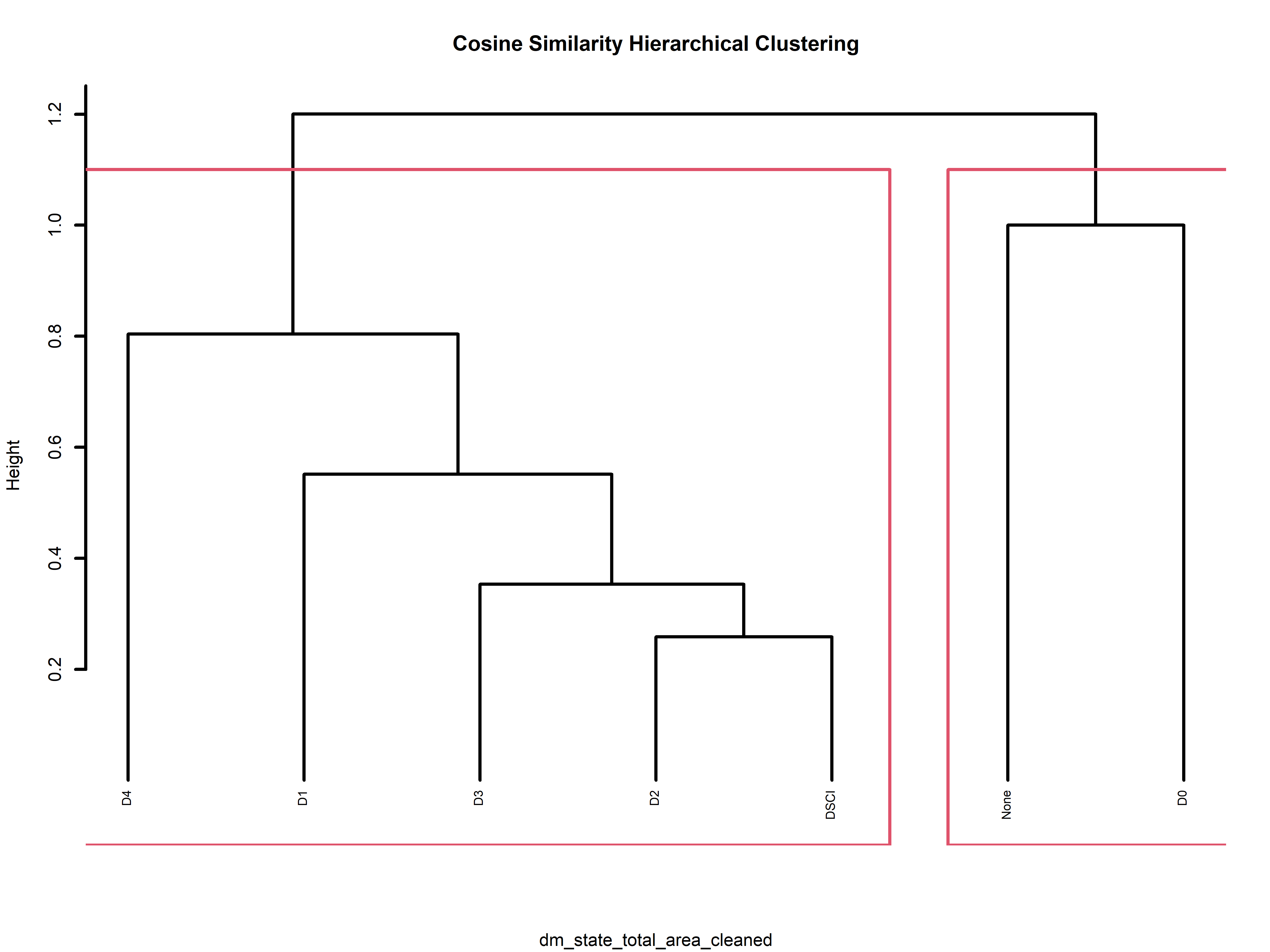
These dendrograms provide a visual representation of our hierarchical clustering results, shedding light on how our data points group and associate within the hierarchy. Let’s take a closer look at one example, the dendrogram for “dm_state_total_area_cleaned”. Here, we can observe a compelling clustering pattern. Drought intensity values such as “D4”, “D1”, “D3”, and “D2”, along with the “DSCI” values, form a cohesive cluster. Meanwhile, “None” and “D0” are clustered together. This alignment intuitively makes sense since “None” and “D0” represent areas unaffected by drought, while the other values denote varying degrees of drought impact. Notably, “D4” appears to be slightly separated from the other drought levels, underscoring its status as the most severe drought level per the drought monitoring database.
Additionally, the text dendrograms offer intriguing insights by revealing which words tend to co-occur in their respective documents. For instance, in the News API data, words like “hurricane,” “california,” “Hilary,” “storm,” and “tropical” are tightly clustered together. This clustering suggests a common usage pattern in headlines, possibly related to a recent event, such as Hurricane Hilary affecting southern California. Note that the data for the News API was obtained September 16th 2023 (updated news headlines can be accessed, but for consistency this is the data set that will be used for the rest of the project).
Another notable observation emerges from the specific wildfire cause data for Oregon Wildfires and Weather. Here, words like “unattended,” “camp,” “site,” “cooking,” and “left” are clustered together, hinting at a narrative where campfires used for cooking are being left unattended, leading to fires.
In the case of the cause comments for the Oregon Wildfires and Weather cause comments dataset, we observe a distinct cluster around words like “pine,” “ponderosa,” “tree,” “lightning,” “struck,” “juniper,” and “single.” This clustering unveils a storyline where lightning strikes are igniting fires, primarily in Oregon’s pine, ponderosa, and juniper trees. These dendrograms not only provide valuable insights but also enhance our understanding of the underlying data structures and relationships. A side note for this particular dataset is the difference and similarity to that of the k-mean analysis on this dataset. The silhouette method determined that k=10 is the optimal number of clusters, however, by hierarchical clustering there are 6 solid clusters and maybe a little more if we wanted to be more specific.
In addition to K-means clustering, the hierarchical clustering approach provides valuable insights into determining an optimal K value, as suggested by the dendrogram’s structure. This recommendation offers crucial context for a comprehensive evaluation, enabling us to compare it with the outcomes of K-means clustering and develop a more well-rounded understanding of how our data naturally forms clusters. To visualize this concept, you can envision the red boxes in the above graphs as representing the optimal K values for each specific dataset. For instance, when analyzing text data collected from the news headline API, it becomes evident that a K value of 5 serves as a suitable cluster representation for the data.
In summary, this section offers an in-depth exploration of our clustering analysis. We delve into K-means clustering across various K values, leverage the Silhouette method to pinpoint the optimal K, and present the hierarchical clustering results, all complemented by insightful visual aids.
Conclusions
After conducting k-means clustering on the datasets, it is evident that there are distinct clusters within the data. The clustering graph clearly shows the separation of data points into well-defined clusters (different amounts depending on the dataset). This suggests that the underlying data can be effectively grouped into this many categories or classes based on the selected features and the chosen value of k.
Furthermore, the distribution of data points within each cluster indicates that the algorithm has successfully identified and grouped similar data points together. This finding is particularly valuable for our analysis as it allows us to categorize our dataset into meaningful segments, which can facilitate more targeted analyses for the topic of wildfires in the United States.
It’s worth noting that the choice of k, the number of clusters, played a crucial role in the quality of the clustering results. In this case, the optimal value of k was determined through techniques such as the silhouette method or elbow method (as seen in the repository on GitHub), ensuring that the clusters are both distinct and meaningful.
In conclusion, the k-means clustering analysis has provided valuable insights into the inherent structure of the data, enabling us to categorize data points into distinct groups. This segmentation can serve as a foundation for further analysis and decision-making in our research into wildfires and drought in the United States over the past two decades.
Our comprehensive analysis utilizing dendrograms has yielded significant insights into the topic of wildfires in the United States. The hierarchical clustering results, vividly depicted in the dendrograms, have illuminated both the spatial and contextual aspects of these wildfires. In the context of drought intensity, the clustering patterns suggest a clear distinction between areas unaffected by drought (“None” and “D0”) and those experiencing varying degrees of drought impact (“D1,” “D2,” “D3,” “D4,” and “DSCI”). Notably, the separation of “D4” from the other drought levels underscores the severity of this category in the United States, as indicated by the drought monitoring database.
Furthermore, our exploration of text data revealed intriguing narratives surrounding wildfires. The clustering of words like “unattended,” “camp,” “site,” “cooking,” and “left” suggests a storyline where unattended campfires, often used for cooking, are contributing to fire incidents. In the specific context of Oregon, the clustering of words like “pine,” “ponderosa,” “tree,” “lightning,” “struck,” “juniper,” and “single” points to the significant role of lightning strikes in igniting fires, particularly among pine, ponderosa, and juniper trees. Also the clustering of “lines”, “pole”, “power”, “fell”, “powerlines”, and “wind” create the story of wind felling powerlines and causing wildfires. These are three scenarios that text data has reveled, and therefore we should be aware of these moving forward in wildfire prevention.
Overall, the dendrogram-based analysis has not only provided a structured understanding of how wildfires are geographically distributed and how specific words co-occur but has also shed light on the severity of drought conditions and the causes of wildfires in the United States. These insights are invaluable for informed decision-making and planning aimed at wildfire mitigation and resource allocation.
- “Kmeans by Hand in Python.” Gates Bolton Analytics, gatesboltonanalytics.com/?page_id=924. Accessed 29 Sept. 2023.
↩︎ - “Clustering in R.” Gates Bolton Analytics, gatesboltonanalytics.com/?page_id=260. Accessed 29 Sept. 2023.
↩︎ - “Sklearn.Cluster.Kmeans.” Scikit, scikit-learn.org/stable/modules/generated/sklearn.cluster.KMeans.html. Accessed 2 Oct. 2023.
↩︎ - “Hclust: Hierarchical Clustering.” RDocumentation, http://www.rdocumentation.org/packages/stats/versions/3.6.2/topics/hclust. Accessed 2 Oct. 2023.
↩︎ - Jokanola, Victor. “How to Interpret Silhouette Plot for K-Means Clustering.” Medium, Medium, 5 Aug. 2022, medium.com/@favourphilic/how-to-interpret-silhouette-plot-for-k-means-clustering-414e144a17fe.
↩︎
